Showing posts with label Paintings. Show all posts

Monday, February 8, 2016

Black History Month Value Portraits

For Black History Month, I wanted to do a portrait drawing lesson showing value scale.  Last week, the students were given one of 6 famous African Americans and read a short biography about their person.  To begin the lesson, we made value scales and practiced shading with pencil.  Next, students practiced drawing their person's portrait on a scrap piece of paper.  My main goal was for students to draw their person on their tie-dye paper (which we made in a previous class) and use sharpies and pencils to add the value.  However, I could see that this particular skill was far too advanced for 5th and 6th graders.  I quickly realized that drawing value portraits was too abstract of a concept for my students because they were instructed to look for the shapes that the highlights and shadows made on their faces.  Most students got so discouraged that they stopped drawing altogether.  I had a week to devise another plan before I totally scrapped this project.  So, I came up with the idea of drawing on transparencies and painting the shapes the shadows and highlights made by tracing them right on the transparencies.  I feel this was the perfect accommodation for my students in learning about value scales and realistic portrait drawings.  In the future, I will start with this technique and develop another lesson to follow this one where students can create a grid drawing and paint the value scales on their own.  We will be displaying these striking portrait paintings at our annual Black History Program!


Booker T. Washington by Adreana 


Bessie Coleman by Amani


Frederick Douglas by Jayven


Jackie Robinson by Antoine 
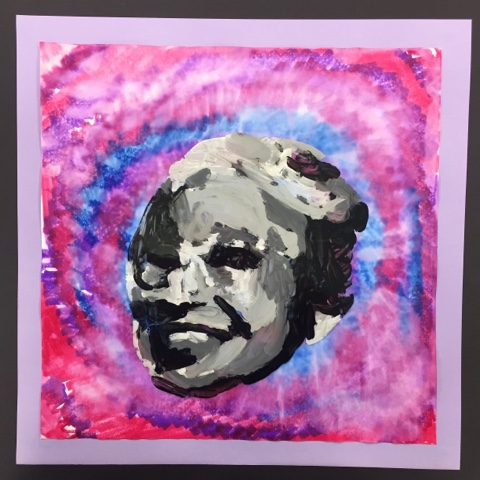

Rosa Parks by Faith 


Dr. Martin Luther King Jr.  by Sidney


Thursday, January 16, 2014

Squish Painting


This was a very fun experiment I did with my 6th graders yesterday.  I call it Squish Painting.  Basically, this is an experiment in color mixing.  They take a scoop of paint and put it on their paper, place the wax paper on top, and squish the colors together until the whole background is filled up.  And you may be thinking this is a bit too young for 6th grade.  Yes, it probably is, but I was looking for a fun way to add color to the background of their paper so we can do more surface work next time.  We are currently participating in the Picture The Music art competition for the St. Louis Symphony.  For the contest, students are asked to create a work of art that represents a certain piece of music the Symphony has selected.  Before we began, we discussed the different moods and feelings you can get by listening to music and the moods that certain colors can portray.  Students were to choose colors that they think best represented the music and squish them under the wax paper to mix them together and make new colors.  I'll post pictures of our finished art next week...


Wednesday, March 20, 2013

Handprint Rainbows

Here in STL, we are not even close to Spring weather and I cannot take another minute of 20 degree temperatures, so we are bringing Spring into the building with flowers, bees, and RAINBOWS!  What says 'elementary art' other than a rainbow painting?  Nothing.  I did this project with my 2nd graders and they did a great job.  I wouldn't go any lower than that unless you have some really great Kg. & 1st graders who have self-control, can handle a mess, and have exceptional listening skills.

First, we drew some clouds and colored the 'negative space' with the blue crayon for sky.  Next, I went around and lightly drew a big arc on their paper so they had a guideline to follow for the handprints.  I demonstrated how to press (not slam, slap or tap) their hand into the puddle of paint and carefully stamp their hand on the arc, wipe off the paint with a paper towel, and stamp the next color.  Of course, we had to discuss ROYGBIV and the color spectrum so they knew what order to print their colors.  The results were great, but I have to say...I probably won't be doing this again until NEXT Spring.  It was a lot of prep work and a LOT of clean-up!  Hahaha.


Tuesday, March 19, 2013

Sunrise Silhouettes


     These paintings made by my 5th graders turned out so beautiful!  Using watercolors, we painted our skies first, focusing on using colors that we would find in a sunrise or sunset.  Next, we painted the tree branch silhouettes with black tempera paint.  This project lends itself to the discussion about how backlighting the subject creates outlines or shadows and loses detail.  Painting tree branches is a great way to teach kids how much pressure they should put on the paintbrush for the desired result.  We painted the large branches first, making sure we loaded our brushes with an ample amount of paint and pressed down on the bristles to make the thick lines.  For the medium branches, we used less paint and focused on pressing down and lifting the brush up at the end to create a variation of thickness.  Lastly, we worked on 'flicking' our brushes to create small, thin branches.  For added detail, I gave the students Sharpies to add the very small, fine branches to their silhouettes.  Here are two great examples:

Elijah's Painting


Timothy's Painting


Wednesday, September 19, 2012

Cross-Curricular

      If you are like me, you are always looking for ways to connect art to the common core standards.  Yes, we do this indirectly with almost any lesson we teach.  But, how can we teach directly to implement the skills and strategies that our students NEED to know in an art lesson?  One way is through writing.  Our school has focus words that will prepare our students for the standardized test in the Spring.  This month, we are focusing on Summarizing.  So, I decided to have the students summarize the life and work of Andy Warhol.  First, we watched this fabulous video about Andy Warhol from the creators of "Getting to Know the World's Greatest Artists."


(This is a short preview of the video from You Tube.  I have the full version on DVD.)

      Next, the students wrote a summary about the life and work of Andy Warhol.  I gave them ideas such as, who was he, what did he do, what kind of art did he make, and so on.

Their summaries were pretty interesting!
Here's a good one:

Here is how I displayed the writing and the artwork together:


      For the art portion of the lesson, we created flower prints using tissue paper and water.  I had the students cut out the flower shape, trace it on the paper, moisten the flower shape on the paper, and then lay the tissue paper flower onto the wet paper.  They were amazed how the color can transfer from the flower to the paper just using water!  For the background, we used pieces of tagboard dipped in black, yellow, & green paint to stamp the texture around the flower shapes.  Here is the inspiration artwork by Andy Warhol that we looked at before we began our artwork:


Tuesday, April 10, 2012

Starry Starry Night

I decided it was time to break out a lesson on the ever-popular Starry Night for my 2nd graders.  I found this fun video on You Tube that I shared with the class before we began our painting:

I went over Van Gogh's textural use of paint & his depiction of movement and rhythm.  This was a very messy project, so I suggest a tall cup of coffee to any of my adventurous colleagues beginning this lesson.  First, we worked with dark blue paint for the sky.  Next, I had the students dip a fork in white and yellow to mimic the effect of impasto and Van Gogh's brushstrokes.  Then, we added yellow dots to the sky and circled around them with the forks.  The students then worked on the mountains & the ground, first with a solid color and then dipping their fork in contrasting colors to add the impasto effect.  Lastly, we painted the large tree in the foreground with black & used brown on the fork to add texture.

Step 2 was creating the houses for the little village in the second class period.  It was just too much to do this in day 1, so I thought it would be best to wait until the paint has dried.  When I passed out their paintings I asked them to compare and contrast their paintings to Van Gogh's painting and think about what we need to add to make ours more similar to the original Starry Night.  They pointed out things like the moon, the houses, and smaller trees & bushes.  I had the students draw the objects on white paper, color them with colored pencils, and glue them to the background.  Voila!

Sidney's painting

Brian's painting

Alan's painting

Aaliyah B.'s painting

Friday, January 6, 2012

Art + Music + Kinders = 1 Tired Teacher

Today we worked on our art for the annual Picture The Music Art contest for the St. Louis Symphony Orchestra.  We talked about how different kinds of music and evoke different emotions and how certain colors can match those emotions.  (Deep, I know).

Then, I had the students pick three or four colors that they thought best matched Beethoven's 5th Symphony.  They 'scribbled' the colors all over their paper and then I sprayed water on top of their paper so all of the colors would bleed together.  This was the background for our paintings.

Next I gave the students a tray of tempera paint and gave them some specific things to paint.  First, I told them to paint a wavy line, then a square, three circles, two straight lines, etc.  I think they are fabulous and we had lots of fun creating these musical paintings :)

Our "marker paintings" drying on the floor

a finished painting with the details added on top